Landing Pages Demystified: 21 Conversion Hacks (With Examples)
Say you get someone to visit your website.
Okay, great…
And say that “someone” is an interested prospect who, if you play your cards right, might be open to doing business with you. Now we’re talking.
How do you get them to go from “interested prospect” to “buyer?” Depending on what you’re selling, there could be a big gap between the two.
Shoddy marketers do a poor job of guiding their prospects over this dangerous gap. They lose people to distraction, boredom, or an unorganized, weak sales message.
Fortunately, there’s a way to lay down scaffolding for a cozy little bridge to guide your prospects across safely: landing pages.
But for landing pages to “work” (i.e., get visitors to do what you want them to do), you have to pull them off right…
The Internet = Landing Page Wasteland
I should clear something up before we go any further. When I use the term “landing page,” I’m referring to any page Seth Godin mentioned that’s meant to:
- Get a visitor to go to another page
- Get a visitor to buy
- Get a visitor to give permission for you to follow up by email, phone, etc.
- Get a visitor to tell a friend
- Get a visitor to comment or give you some sort of feedback
How many of these pages have you seen online that are great? Probably a lot less than the bad ones.
The internet’s a digital wasteland of bad landing pages. Do some shopping or click on a few Google AdWords ads, and it won’t take you long to find some downright atrocious “specimens.”
But your landing pages don’t have to be like that. You can use the tips below to make a good impression on your prospects, get more conversions, and stand out from your competitors in all the right ways.
Here’s how to do it…
Setting up a High-Converting Landing Page Framework
Your landing page design is a necessary, but not sufficient, component to improve your conversions. You need a solid design and solid copy; the design is just the first step.
The hallmark of a great design is how well it features your sales copy. Don’t get so caught up in everything looking pretty that you lose sight of that.
A great landing page looks professional. It makes it easy for people to dive in to your sales copy, and to stay engaged until they get to the end and do what you want them to do.
Here are a few tips to keep in mind:
1. Follow a Logical “Scent”
How do people get to your landing pages? Where do they come from?
Maybe your visitors come from pay per click campaigns or search engines. Or blog comments, forum threads, or somewhere else.
Regardless of where they come from, your visitors end up on your landing page because they have a certain expectation of what they’ll find. You create the expectation by the language you use to get them to your landing page.
People track information similar to how animals follow a scent. If your landing page discusses what they expect, they’ll keep reading. But if it doesn’t meet their expectations, they’ll give up and look for information somewhere else.
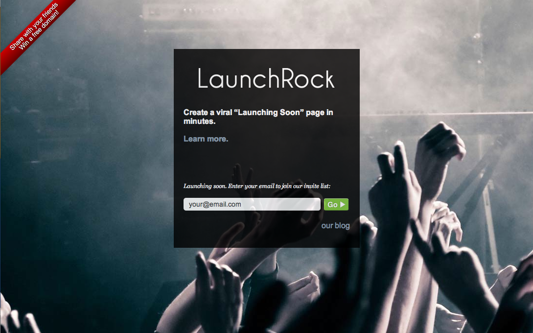
Get Elastic talked about this in an article on paid traffic:
2. Have One Clear Purpose
You didn’t spend all that time and effort creating a landing page to entertain people, did you?
What makes that page important? Why do you want people to visit it, and what do you want them to do after they see it?
It’s important to have a clear answer to these questions. You can design your page to accomplish anything Seth Godin discussed, but make sure you design it to do something.
Check out this popup Marcus Sheridan put together with one clear purpose: getting people to sign up to an email list.
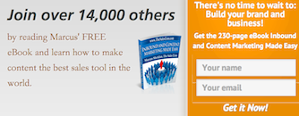
Landing pages with no purpose or 10 purposes lead to the same results: confused visitors and low conversions.
3. Avoid Visual Clutter
Everything on your landing page should support your underlying purpose.
That means including only elements that move the visitor closer to doing whatever it is you want them to do.
Go through each of the elements on your landing page. Is that stock photo adding anything to your sales message? Are those multiple links to unrelated webpages helping, or hurting your cause?
Your visitors have plenty of reasons to get distracted already. You can’t afford to give them any more ways to get sidetracked. Streamline your page and get rid of all the rest.
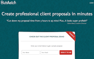
Bidsketch’s homepage is a great example of a clutter-free design. It makes it easy for people to do what Bidsketch wants them to do: enter their email info and sign up for a free client proposal demo.
4. Use a Basic Color Scheme with Strategic Contrasting Colors
Color’s underrated.
A lot of people don’t give it much thought. Or they check out what their competitors are doing and copy them. Both of these approaches are shortsighted.
You don’t have to obsess over this, but you probably should give color more than a passing thought. The key here is to find something that’s easy to read, looks professional, and makes it clear where the visitor needs to act.
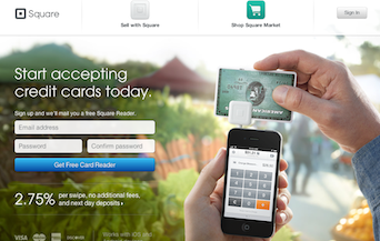
Here’s how Square does this. Notice how the part where visitors enter their information stands out:
Good news is you’re as clueless about graphic design as I am; you don’t have to figure this out on your own. There are tons of free color picker tools to recommend a color scheme and get you going.
5. Watch out for Outbound Links
So, you finally get someone onto your landing page.
Phew. That took a lot of time, effort, or money (maybe all three). But they’re on your page now, and you’re eager to convert them into paying customers.
Riddle me this: why in the world would you give them multiple outbound links to click on?
It doesn’t make any sense, but that’s exactly what a lot of businesses do. They give their visitors ways off the page. Each link is like another hole. Poke enough of them, and you have a sieve that costs you would-be customers.
Don’t include outbound links unless you have a great reason. Everything on your page should move the visitor closer to doing what you want them to.
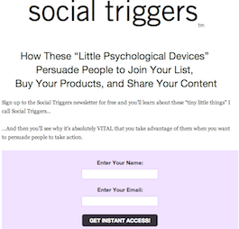
Take a look at Derek Halpern’s newsletter page. No external links. He directs the visitors to a single offer (signing up to his newsletter), and makes it easy as he can for people to accept that offer.
6. Direct Incoming Traffic to Your Landing Page
A common mistake businesses make is directing inbound traffic to their homepage. I’m not sure what the thinking on this is (feel free to leave me a comment and give me your theory!), but it’s ineffective at best and a downright waste of time at worst.
You can’t trust that visitors will land on your homepage and find their way to your landing pages.
Why not just cut out that step and send people straight to your landing page instead? The easier you make it for them to get to your landing pages, the easier it is to convert them into paying customers.
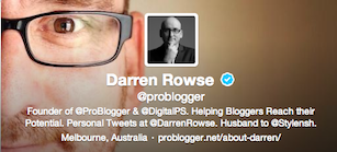
Darren Rowse does this. On his Twitter profile, he links to a landing page instead of the Problogger homepage.
Getting Their Attention: Now or Never
7. Write a Great Headline
You can’t afford to write a mediocre headline and expect to convert traffic into paying customers. For a lot of people, your landing page is the first time they’ve been on your site… and your headline is the first thing they see.
So do what you can to make a great first impression. Use classic persuasion principles, and check out these tips to write better headlines.
On Be A Freelance Blogger, Sophie Lizard catches your attention right from start. Check out her headline, which intrigues would-be bloggers with something they’d find valuable.
8. Clear Value Proposition
Each of your landing pages has one clear purpose, right?
Well, you can’t just twist people’s arms to get them to do what you want them to do on your landing page. Appealing to your visitors’ self-interest is far more effective.
What does your visitor get out of doing what you want? You need to make this clear as soon as you can. If your visitors don’t understand the payoff, they won’t bother to stick around.
InDinero makes it clear what the visitor gets right away:

9. Filter out the Wrong People
When you write great web copy, you select the prospect just as much as the prospect selects you. It might not seem like it, but it’s a two-sided exchange.
A lot of businesses are worried about offending someone, so they don’t target the people they want to become their customers. They target everyone instead, and that weakens their appeal.
Can you imagine little ninth-grade you (sweaty palms and all), going to ask every girl to dance…. one after another? How successful do you think you’d be? Couldn’t you improve your chances by being a bit more selective?
The better you know exactly who you want to target, and the more you focus on them from the second they see your landing pages, the more persuasive your web copy becomes.
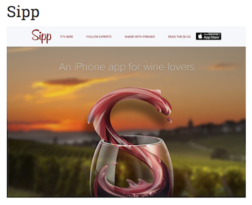
Take a look how Sipp does this. If you aren’t a “wine lover,” you aren’t one of their targeted customers.
10. Use Subheadlines
Subheads aren’t always necessary, but they can come in handy a lot of times.
If you can’t sum up exactly what you’re offering and what it can do for people in your headline, you can use a subheadline to explain it a bit further.
Here’s how Passive Panda does it on their sales and marketing page:
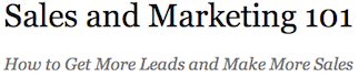
See how that works? The subhead’s message expands on the original headline by describing what the reader will get from the page. Apply the same principles for writing headlines to keep your subheads compelling.
Turning Attention Into Desire
11. Don’t Obsess over Length, but Don’t Waste Words
How’s that for some copywriting zen?
I’ve already mentioned how I think the long copy vs. short copy “debate” is ridiculous. Peep Laja’s takedown on this is more eloquent than mine, but here’s my take:
Give people enough info to feel comfortable making the decision you want them to make (whether it’s signing up to an email list, buying a product, etc.) and nothing more.
Consider the price and complexity of what you’re selling. People will want to see more info before buying a car than a DVD.
12. Use Bullet-Points to Break up Copy
Most people scan text online instead of reading straight through. The best landing pages accept that; they make it as easy as possible for people to scan.
Don’t intimidate your readers with walls of text. Break up your copy with white space and bullet-points. Make it easy for your readers to hop on and slide straight to the end. Just like those automated walkways at airports!
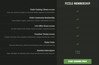
Fizzle, an online business training program, takes a cool approach to break up their sales copy and incorporate visual elements:
13. Consider Using Video
Video’s all the rage these days, and with good reason: people’s attention spans are getting shorter.
In some cases, using a video element on your landing pages can improve your conversions. I recommend you: 1) make them short; 2) make them warm and personal; and 3) use them to show people what your product or service can do.
You can use video to supplement text copy. That way people can watch the video if they want, but you aren’t forcing them to sit through something they have no interest in seeing.
Here’s how Copyblogger does it on their homepage:
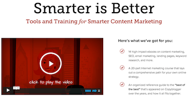
14. Consider Using Related Images
Using images on your landing page is great… as long as they add to your sales narrative and don’t distract people. They can also break up walls of text.
Your sales copy can talk about what your product or service does, but your image can show it. That’s why those cheesy infomercials are still on the air (and making big $$$). It’s more effective to demonstrate something than discuss it.
How can you use images to show people what your product or service can do? If you can find a way to do that, consider including using them on your landing pages.
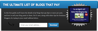
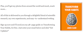
James Clear uses a a cover image of his free eBook to convince people to sign up to his email list and get a copy.
Building Your Case: Credibility
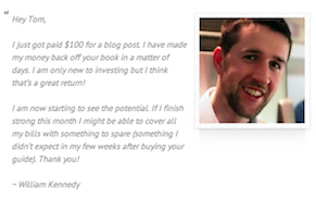
15. Strategic Testimonials
If other people endorse what you’re doing, and you show those endorsements off, it makes new visitors more likely to do business with you.
Weave a few testimonials into your landing pages for more conversions. It’s best to be picky; killer testimonials use specific language. “You’re great”…is not a great testimonial.
In addition to being specific, solid testimonials also overcome common objections. Is your product expensive? Use a testimonial raving about how your product or service was “well worth the cost.”
Take a look at at this testimonial from Tom Ewer’s “Freelance Writing Online” product. It does a great job at overcoming a possible objection (price).
16. Positive Social Proof
“If all of your friends jumped off a bridge, would you do it too?”
In a word: yes. Ok, not literally, but that’s how social proof works. What other people are doing becomes what’s considered the “right” thing to do.
If you have over 50,000 customers and have been featured in the New York Times, feature that on your landing pages! The only caveat: make sure you have enough positive social proof before you decide to display it.
Henneke Duistermaat’s Enchanting Marketing takes advantage of this. Take a look at all this social proof on her homepage.
Overcoming Objections
17. Remove the Risk with a Guarantee
If you don’t have a guarantee, you’re losing customers.
People are skeptical, and that only makes sense. Let’s face it: the Internet is kind of a cesspool where scammers gather. Even if someone wants to do business with you, they might hesitate if there’s a financial risk.
That’s why a powerful guarantee works so well. You ease people’s minds; they have nothing to lose.
Speaking of powerful guarantees… Danny Iny’s guarantee from his Audience Business Masterclass program is one of my favorites. Check it out:
![]()
18. Use Trust Indicators
You know these kind of things?
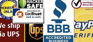
Yeah? You probably see them everywhere. Those are trust indicators, and they’re one of the easiest ways you can boost your landing page conversions.
It might not look like much, but these types of subtle changes can make a big difference to skeptical prospects. PETCO added a security seal to their homepage and increased their conversions by 8%!
What can you add to make your landing pages more trustworthy? It’s well worth the effort.
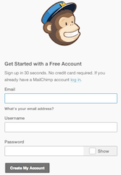
19. Don’t Ask for Too Much Information
If prospects have to sign their names in blood just to join your email list, you’re doing it wrong.
When you ask your prospects for information, it’s only natural to be curious. But you should resist the urge to ask for anything more than what’s absolutely necessary. Each additional piece of information you ask for adds friction and resistance.
Do you really need their last name? Address? Probably not. Strip it down to the bare minimum, and you make it easy as possible for people to do what you want.
When you go to create an account at Mail Chimp, you’re only asked for an email address, username, and password. No mother’s maiden name required.
Make Your Offer
20. Make One Offer per Landing Page
This all goes back to having one clear goal for each landing page. Keep the offer you make congruent with that goal.
If your page is meant to sell your consulting services, make that offer and nothing else. If you give someone the chance to contact you, sign up to your email list, and check out your past articles… all at once… they probably won’t do anything.
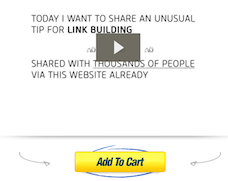
Glen Allsopp does this well in his BacklinksXXX program (it’s not as dirty as it sounds!). There’s video sales copy and an “add to cart” button to buy. That’s it.
21. Make Your Call to Action Stand Out
Your “call to action” is basically how someone does what you want them to do. If you want them to sign up to your email list, it’s the button they press to do it. If you’re selling something, it’s the “add to cart” button.
If someone can’t find your call to action, everything up until this point was a waste.
That’s why yours has to stand out. Here are a few things to keep in mind to improve your conversions:
- Make your call to action button large: sounds obvious, but it’s amazing how many people don’t do this. Make your call to action easy to find.
- Use a contrasting color for your call to action: this makes your call to action “pop” when visitors see it, which is exactly what you’re going for.
- Frame your call to action in terms of what the visitor gets: using words like “continue” or “submit” is boring. Instead, use terms like “get my free report,” or “download my report.” Frame it in terms of what they get.
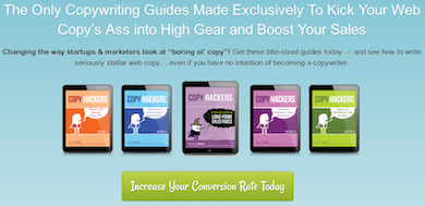
Copyhackers does a great job of applying all three of these principles. Check out the green button on their homepage:
Over to You
Apply these tips, and you can turn your landing pages into conversion machines.
What are your favorite tactics to improve landing page conversions? What’d I miss? Leave me a comment below and let me know; I’d love to hear from you.